Most total rewards statements get opened once and forgotten. Employees skim the number at the bottom, maybe screenshot it for a mortgage application, then never look at it again.
That’s a wasted opportunity. You’re sitting on data that shows employees exactly how much you invest in them beyond their paycheck. If they don’t read it, that investment doesn’t land.
Here’s how to build a total rewards statement people actually open, understand, and remember.
- Ditch the jargon. Skip terms like “premium equivalent” — use plain language employees actually understand.
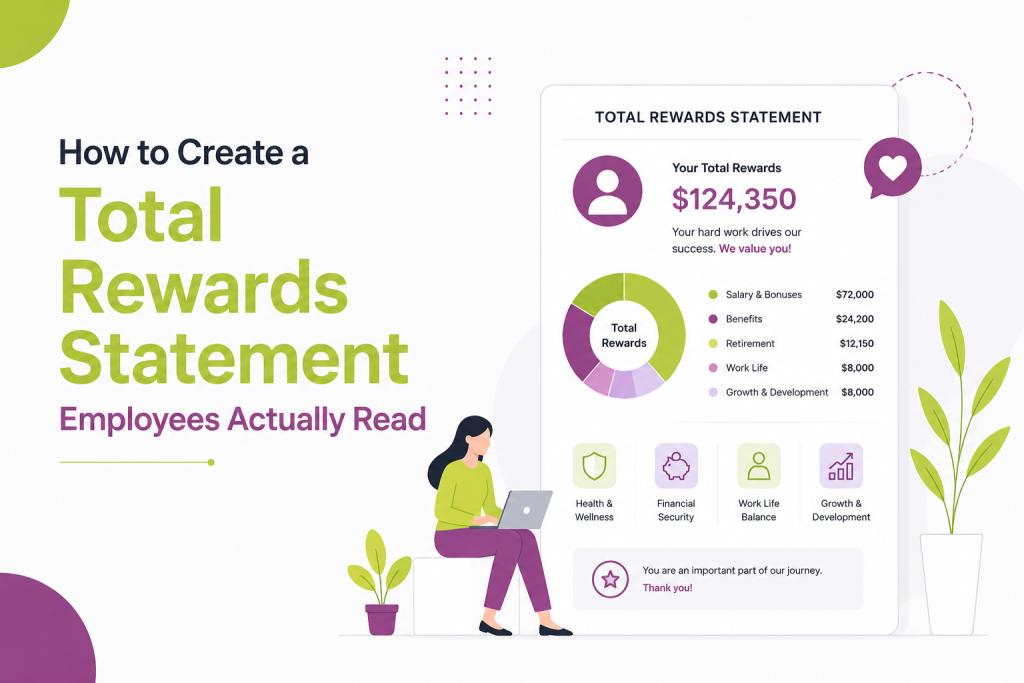
- Lead with the total number. Open with total compensation value, then break down where it comes from.
- Organize by employee questions, not HRIS categories. Structure around “what am I worth” and “what happens if I stay,” not internal pay-field labels.
- Translate benefits into real-world comparisons. Show what health coverage would cost on the open market, not just a line-item dollar figure.
- Personalize with tenure and year-over-year change. Show growth over time using the employee’s own history, not generic market data.
- Design for mobile. One number per section, clear hierarchy, no dense tables.
- Time it to something meaningful. Pair the statement with performance reviews, open enrollment, or work anniversaries.
- Explain equity in plain terms. Cover current value, vesting timeline, and what happens if they leave — skip the legal language.
- Give employees a way to ask questions. Include a contact or FAQ link so confusion doesn’t dead-end.
- Test with a small group first. Catch confusing sections before a company-wide rollout.
Why most total rewards statements fail
The typical statement is a PDF dump from your HRIS. It lists base salary, bonus target, benefits cost, and retirement match in a table. Technically accurate. Practically useless.
Three problems show up again and again:
Too much jargon. Terms like “employer-sponsored premium equivalent” mean nothing to someone outside HR. Employees read it once, get confused, and close the tab.
No context. A number like “$4,200 in health benefits” means little without a comparison point. Is that a lot? What would it cost on the open market?
No story. The statement lists facts but doesn’t explain why any of it matters to the person reading it. It reads like a compliance document because that’s often exactly what it started as.
If your total rewards statement reads like a W-2, employees will treat it like one: file it away and move on.
Also read: HCM vs HRIS: What’s the Difference?
Start with the employee’s questions, not your data structure
Before you touch design or format, list out what employees actually want to know:
- What am I really worth to this company?
- How does my pay compare to similar roles?
- What happens to my retirement savings if I stay another year?
- What would I lose if I left?
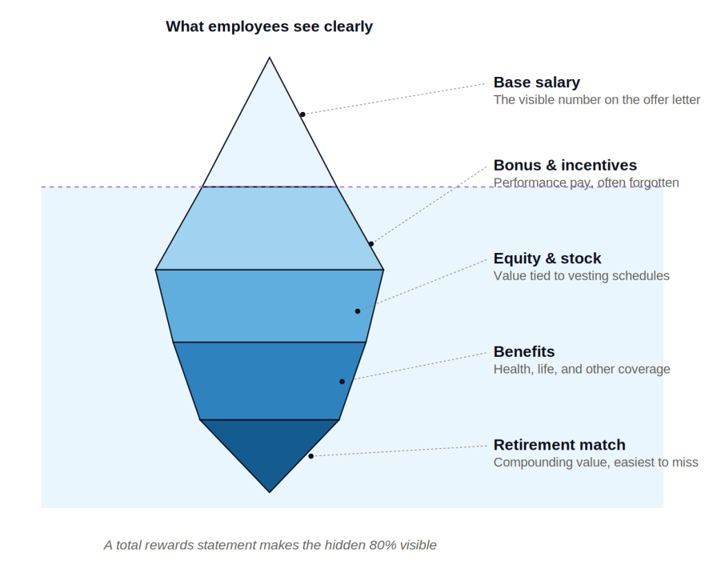
Build your statement around these questions instead of around your compensation database’s field names. Compensation teams naturally organize by system structure: base pay, variable pay, benefits, perks. Employees don’t think in those categories. They think in terms of financial security, growth, and fairness.
Reordering your statement around employee questions instead of internal categories is the single biggest lever for readability.
Also read: Pay Compression: How to Spot It and Fix It Before It Costs You Talent
Lead with the total number, then build the story around it
Open with the headline figure: total compensation value, including salary, bonus, equity, benefits, and retirement contributions. Make it big, make it clear, and don’t bury it under definitions first.
Then walk through where that number comes from, in plain language. For example:
- Base salary: what they’re paid for showing up and doing the job
- Variable pay: what they earned this year based on performance
- Benefits: what the company pays so they don’t have to
- Retirement: what’s being set aside for their future, including the match
Each section should answer “why does this exist” in one sentence, not just state the dollar figure.
Translate benefits into real-world equivalents
Health insurance costs are abstract until you compare them to something concrete. Instead of stating “employer contribution: $9,600,” try: “Your company covers most of what a comparable individual health plan would cost on the open market, which often runs $12,000 to $15,000 a year.”
Same logic applies to other benefits. Turn line items into comparisons:
- Life insurance: what it would cost to buy the same coverage independently
- Parental leave: the number of paid weeks, not just a policy reference
- Retirement match: what that match compounds to over 10 or 20 years at a modest return
This kind of translation takes real research and real numbers, not vague marketing language. It’s also what makes a statement feel honest instead of promotional.
Personalize wherever the data allows
Generic statements feel like mail merge documents because that’s usually what they are. Personalization doesn’t need to be complicated. Small touches make a large difference:
- Use the employee’s actual tenure to show retirement growth over their specific time at the company
- Reference their actual role level when comparing to market data
- Show year-over-year change in their own total compensation, not just this year’s snapshot
Year-over-year comparison in particular tends to get skipped, and it’s one of the most persuasive parts of a good statement. Employees remember what they made last year far better than they remember market benchmarks. Showing growth over time makes the statement personal instead of generic.
Keep the design simple and mobile-friendly
Most employees will open a total rewards statement on their phone, often during a slow moment at work or at home in the evening. A dense, multi-page PDF designed for print doesn’t hold up on a small screen.
A few design principles that consistently improve readability:
- One number per section, with a short label above it, not a table with ten rows
- Visual hierarchy: total compensation biggest, category totals medium, line items smallest
- Short section headers using employee language (“Your health coverage,” not “Medical/Dental/Vision Summary”)
- White space between sections so nothing feels like a wall of numbers
If your current statement requires zooming in to read on a phone, that’s a signal to redesign before you touch the content.
Also read: HRIS Integration: Connecting Payroll, Benefits, and Compensation Systems
Time it to something that matters
A total rewards statement dropped into an inbox in the middle of an ordinary week competes with everything else in someone’s day. Timing changes how much attention it gets.
Good windows include:
- Right after annual performance reviews, when compensation is already top of mind
- During open enrollment, when employees are actively thinking about benefits
- Around work anniversaries, paired with a note about tenure and growth
- Right before exit interviews for departing employees, as a reminder of what they’re leaving behind (this one is underused and often revealing)
Sending it at a neutral, arbitrary date signals that it’s a compliance task. Sending it alongside a moment that already has meaning signals that the company wants employees to actually engage with it.
Explain equity and long-term incentives without the legal language
If your total rewards package includes stock options, RSUs, or other equity, this is usually the section employees understand least and want to understand most.
Skip the legal definitions. Instead, answer three things plainly:
- What they currently hold and its estimated value today
- What vests and when, in calendar terms they can actually plan around
- What happens to unvested equity if they leave
Employees don’t need a securities lawyer’s explanation. They need to know what they have, when they’ll fully have it, and what’s at stake if they walk away early.
Make it easy to ask questions
Even a well-built statement will raise questions. Include a clear path to ask them: a link to a compensation FAQ, a name and email for HR, or a short scheduled window for one-on-one questions during rollout.
Statements that dead-end with no next step train employees to stop reading closely, because there’s nowhere to take their confusion. A simple “questions about this? Reach out here” line signals that the company expects and welcomes engagement rather than passive acceptance.
Test it on a small group first
Before rolling a redesigned total rewards statement out company-wide, send it to a small group across different roles and levels. Ask three questions:
- What number stood out to you first?
- Was anything confusing?
- Did anything surprise you?
This feedback loop catches jargon you didn’t notice and confirms whether your hierarchy of information actually works the way you intended. A statement that makes sense to the compensation team that built it doesn’t always make sense to the sales rep or engineer reading it for the first time.
The bottom line
A total rewards statement is only valuable if someone reads it and understands what it’s telling them. That means starting from the employee’s questions, translating abstract benefit costs into real comparisons, personalizing the data you already have, and designing for a phone screen rather than a printed page.
Get those pieces right, and the statement stops being a compliance artifact. It becomes one of the clearest, most concrete reminders you have of what employees are actually worth to the company, in a form they’ll actually read.